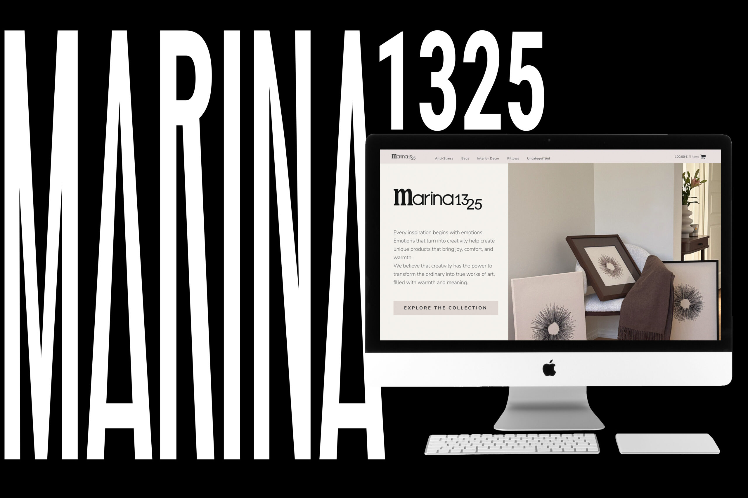
Marina1325

Combining user comfort and business perspective in one B2C website
UX Design
An end-to-end B2C project - from strategy to deployment. 
The client was launching her own handcraft business and needed a website that could sell, not just showcase. I am leading and owning the full design process and will continue to oversee it post-launch. 

My Role

UX Design lead

My Responsibilities

• UX Design - led the whole process of the design, starting from ideation and finishing with prototyping
• UI Design - based on the client's brief, narrowed down the UI elements
• Visual Design - based on the client's brief, established the visual language and aesthetics of the website
• Wireframing - created wireframes of the main, product and product description pages
• Prototyping - created a prototype in Figma based on the wireframed pages
• Building the actual website - wip, building a website on Wordpress based on the design work I did

Problem

Existing platforms couldn't solve the core business problem: visibility, and combining product sales with services in one place. A standalone website was the right call to give the brand full control and a direct path to the customer.

Process

I opened with stakeholder alignment calls to define goals, feel, and visual direction — then moved into competitive research, wireframing, and iterative prototyping. Each phase had a clear sign-off before progressing.

Outcome

Delivered: a validated, client-approved prototype of key pages.
In progress: building a full website.

PROCESS

Goals

1st: validate design direction through a prototype of key pages. 
2nd: build and ship a live, functioning website.

Target Group

Adults aged 20-65, searching for hand-crafted products or services.

Tools

Figma
Lovable
Wordpress
Unsplash

Discovery

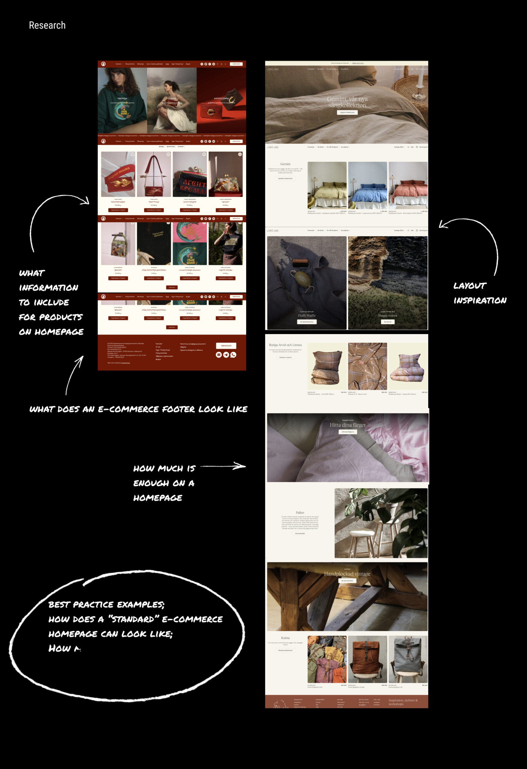
Learning from others

I always start with existing examples to see what works best and what I can bring with me into my design, but also to see what doesn't work and what to avoid in my work. From the cases I have reviewed, I liked the layout and it was generally useful to see how the products are displayed.
Reviewing existing examples.

Vibes of the website

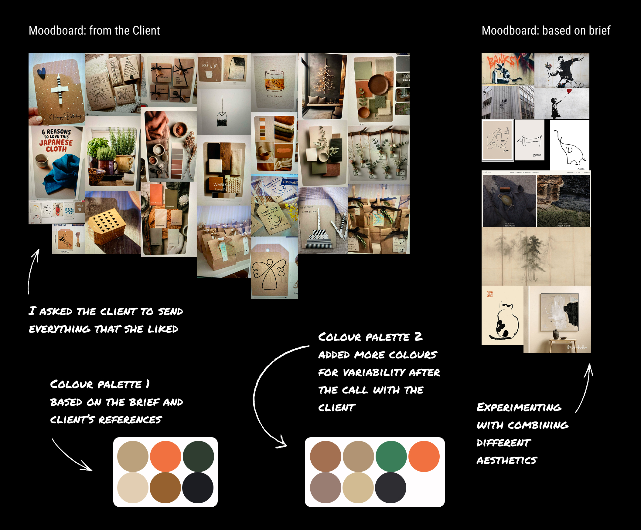
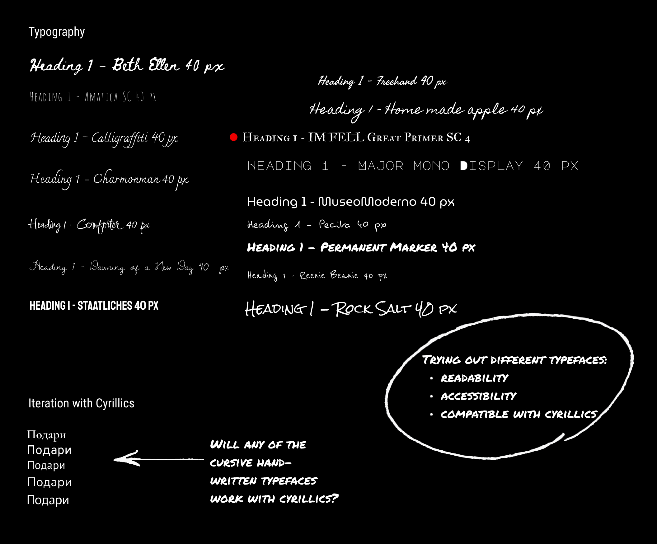
In parallel, I discuss with the client what feel and look they want from their website. The brief was "japanese minilamism, scandinavian design vibes like AB Småland, Banksy, natural colours". I have also asked the client to send me pictures of whatever they like, doesn't matter what. My goal was to understand the preferences of the client through visual media, what vibe to go, what feeling should the website evoke for the user, but also to understand the colour pallette.
Moodboard from the client & me. And a set of fonts to pick the correct one.

Delivery

Ideation

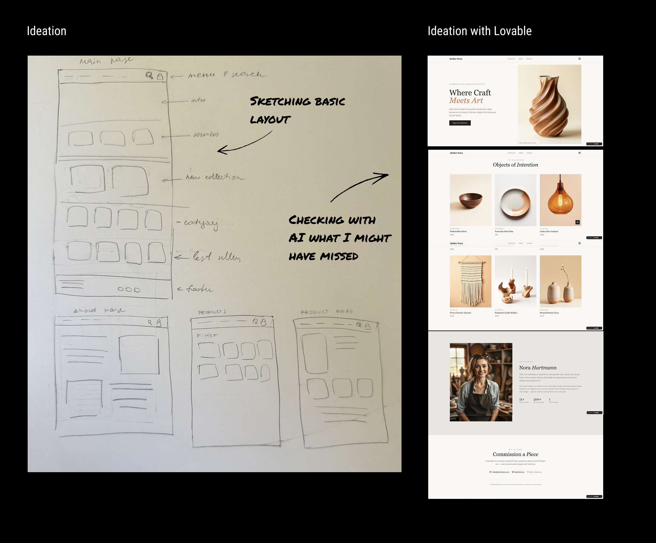
I usually sketch on paper at first just to quickly dump ideas and have an approximate structure of what should be on the page. This method is fast and also gives me an opportunity to think while doing.

I also used Lovable to exercise working with AI.
Ideation on paper and with Lovable.

Wireframing

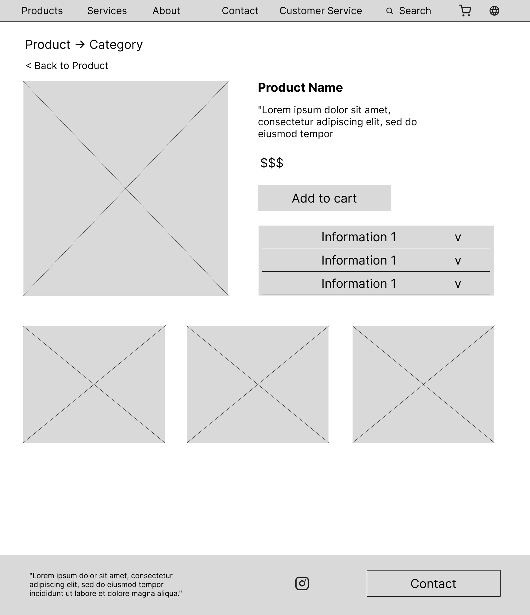
Then I went to Figma to start wireframing. My goal was to:
• have an understandable draft of content elements
• have a draft of content hierarchy
• have a tangible asset to help me and the client narrow down what exactly should be displayed and what's prioritised

For example, I assumed that having products displayed already on the home page is good both from the user perspective, but also from the business:
• user doesn't need to wonder around the website
• the business displays their product right away.
The client, however, felt products belonged on another page dedicated to products. From the user perspective that was better, but the business side loses on not displaying something around products on home page. So we went with my recommendation to keep only category "New In". That way, we don't overload the user with too much info, but also create curiosity around the product.
Wireframes, version 1 on top and iterated final version 2 on the bottom.

Making things pretty

My goals were to:
• have a realistic prototype for the client to understand the direction and react to suggestion
• shape a direction of the visual language for the website
• prepare for building the actual website

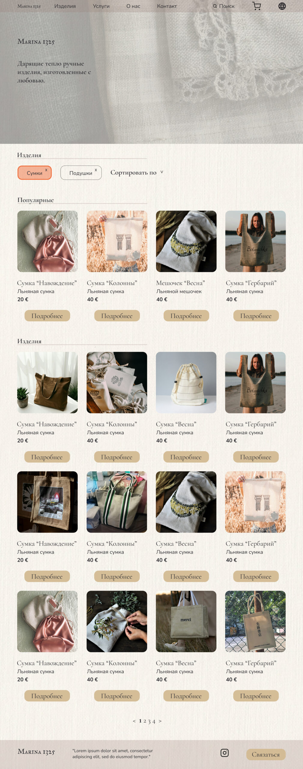
Since I know the client very well personally, I nailed the vibes of the website. However, buttons on each category were hard to read. I had an assumption that it might be the case, but wanted to test on the client. Obviously, that point was taken into consideration and implemented.
First prototype ready to be shown to the client.

OUTCOME

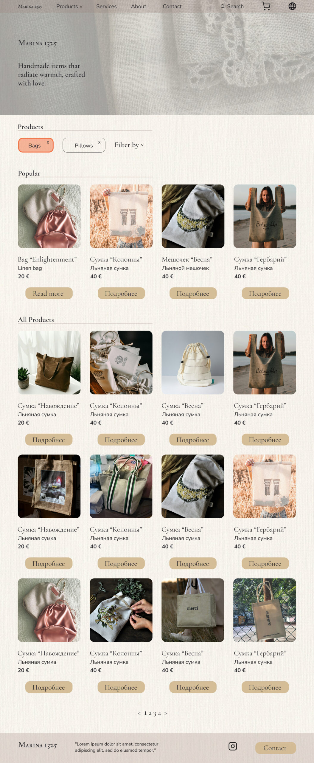
The prototype has survived the review with small ammendments.
On Home page:
• moved category buttons under the pictures
• cropped first image to fit category section on the screen before scrolling.
On Products page:
• cropped first image for the same reasons as the above
On A product page:
• tightened layout and cropped images to avoid need for scroll

Now I feel ready to start building the actual website.
Final version of the prototype. Ready to be made into an actual website.

REFLECTIONS

What I learned

I always take the opportunity to learn from any project I take part in.
In this project I learned:
• UI design - I stepped more into that domain, trying to think as a UI designer and ensure documentation is understandable.
• Product page on a retail website - how to connect warehouse with the webpage.
• Working with AI - prompt writing mostly.
linkedin facebook pinterest youtube rss twitter instagram facebook-blank rss-blank linkedin-blank pinterest youtube twitter instagram