Axe, Axe, Baby
From "Crime and Punishment" to a magazine about axes.

A magaizne about axes inspired by Dostoyevsky's “Crime and Punishment”.
The novel unveils the moral consequences of the main character Raskolnikov’s actions, as he murders a pawnbroker with an ax.
I am generally intrigued by contrasts and dark humor, so here I wanted to play a bit with the seriousness of the novel and the notion of the absurd, so that's how this magazine is about axes and how to choose a good ax was born.
Problem
How would you design a magazie based on a novel?
How could a magazine about axes look like?
Process
1. Re-read "Cime and Punishment" by Dostoyevsky to refreshen some details.
2. Look into magazines of the period the novel was written to see if some elements could be used in my design. As well as look into modern magazines and book designs of the novel
for inspiration.
3. Start narrowing down all the inspirations and chose key elements.
4. Execute the design.
5. Take a small break and then look at the design with “fresh eyes”.
6. Final changes and project submission.
Solution
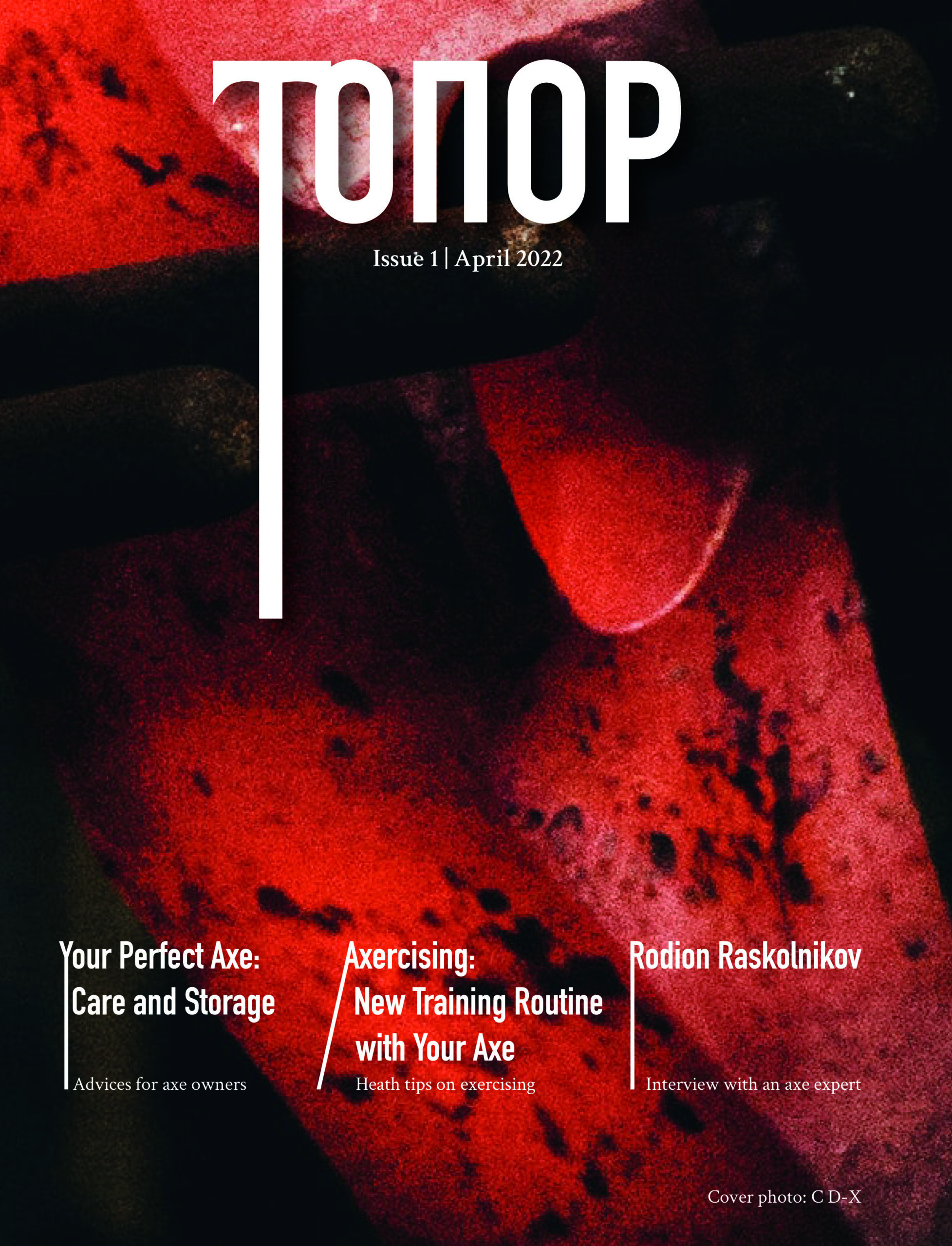
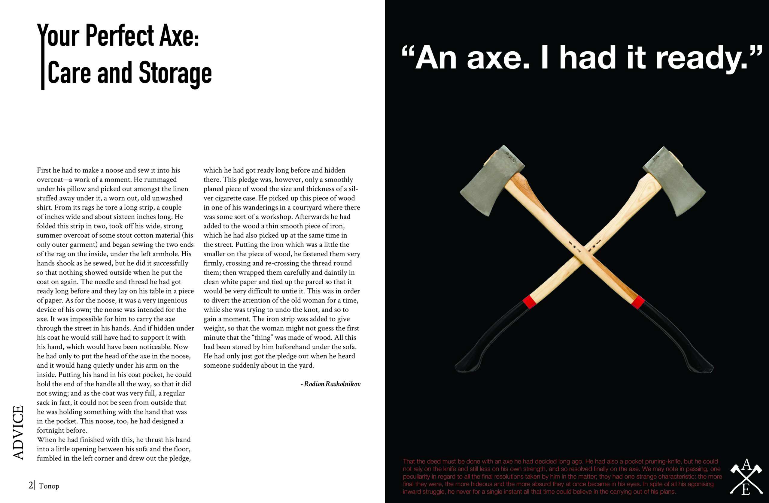
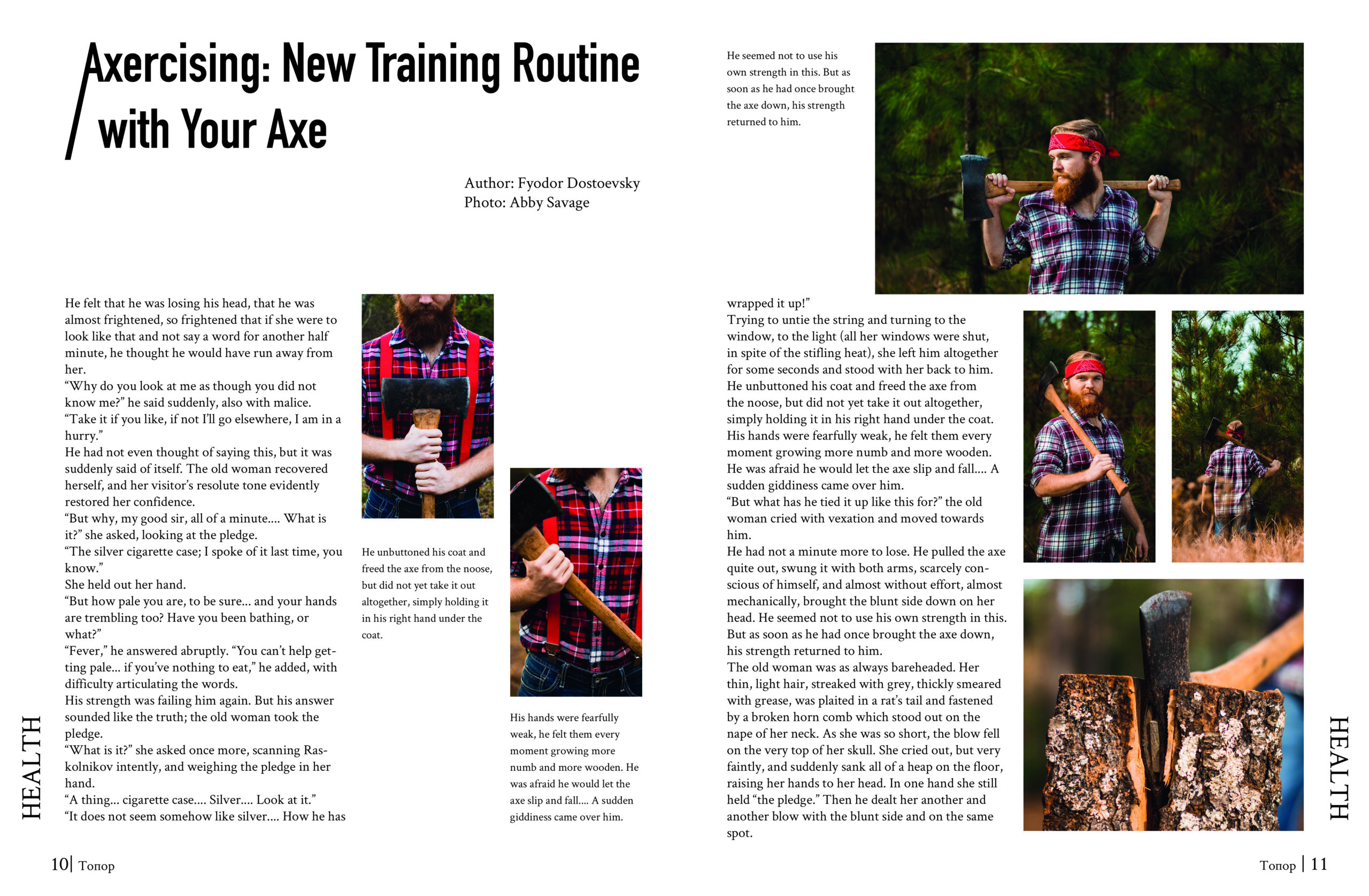
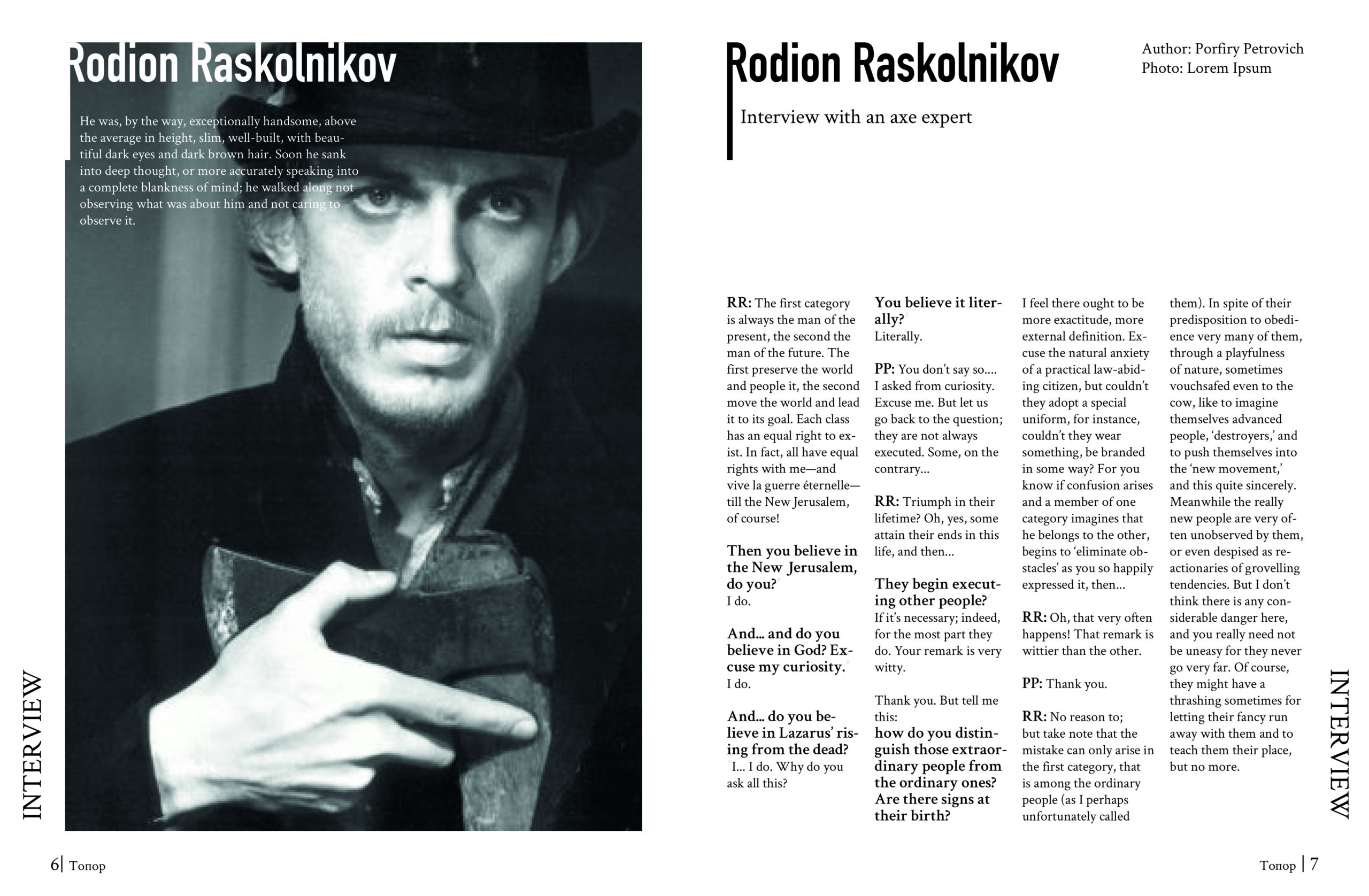
A magazine about axes.
Inspiration and early design exploration.
In the magazine, I wanted to pay a bit of a tribute to the original novel as well as graphic design and typography in 1866. One way to do it was through typography, which is aligned left, both because the ax may leave an uneven border and because spilled blood would be uneven (ax was a murder weapon in the novel).
In terms of colors, I wanted to go with a bit darker colors with some accents like white, and red. Through colors, I wanted to achieve a feeling of a bit cramped yet in its own way comfortable space.
Generally, I strove for minimalism with some interesting and bold details.


