Eat Plastic... If You Will
What plastic do you prefer to your spaghetti?

How can I create a website for an association fighting for an environmental cause that is different from similar organizations as well as captures visitors' attention and desire to join the cause? How can you evoke action by provoking people's feelings?
This is a project for the final assignment in Graphic Design and Typography I course at Linnæus University: "A website enabling the public to take action against plastic manufacturers". The project is for a made-up association of lawyers, politicians, and the public fighting for policies in Europe to ban single-use plastic used in/for food wrapping and make production companies responsible for sustainable packaging and recycling.
Problem
Plastic is everywhere, yet the needed change is so delayed. There are plenty of organizations fighting against plastic use, however, it feels like they are often overlooked.
Process
I began with research through visual materials, literature research, and analysis of similar organizations. This data was analyzed and synthesized, converted into texts, and then used during prototyping in InDesign.
Solution
A website that would stand out from many similar causes, a website that would make the visitor feel something and fuel the desire to join the cause.
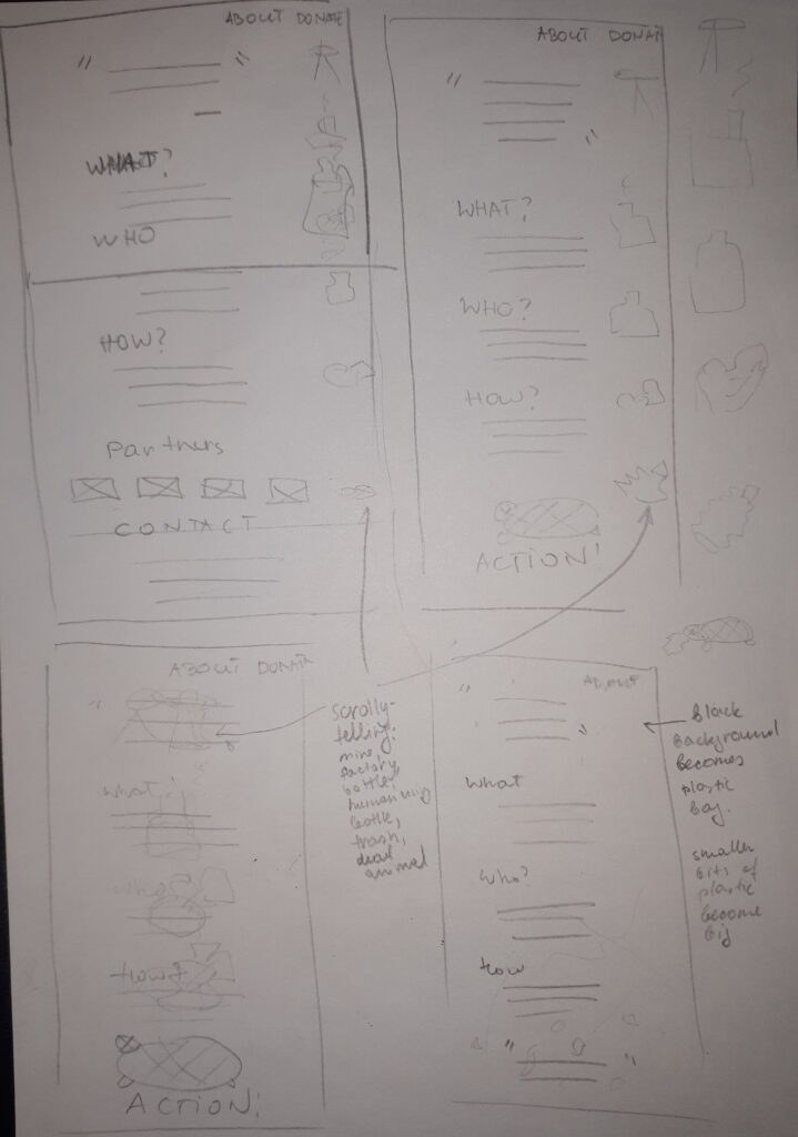
Website ideation and sketching.
Through carefully curated storytelling used in documentary films about plastic waste, the problem was explained with comprehensible language and showed the tragedy of the whole situation. The documentaries made me feel a lot of emotions as well as the desire to act now - this is something I wanted to include in my design.
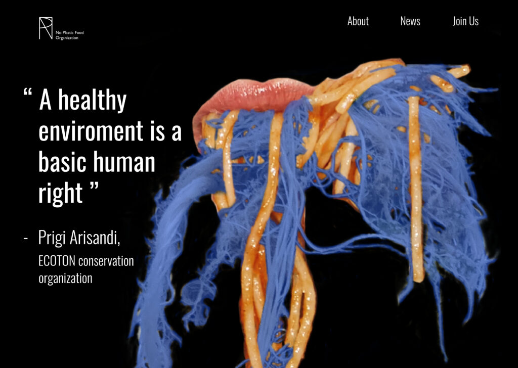
Final version of the website.
Final Version
A website for the association I called No Plastic Food (NPF), not only spreads awareness about the problem but also gives an opportunity to get acquainted with the cause and join it. I wanted my design to evoke feelings and be quite striking and different from other similar causes, therefore I opted for bright bold colors and images. I believe that if design evokes emotions, it is going to be remembered. When it comes to images, I wanted people to be able to relate even more with the problem, because it may have a higher chance of getting people on board.
I also created a logo, which consists of the letters used in the name of the association.
Original pictures used in the project: Jeremy Bezanger on Unsplash, cookie_studio on Freepik


